Rill 0.59 - Re-ordering of timeseries and leaderboards and new dashboard properties!
⚡ Rill Developer is a tool that makes it effortless to transform your datasets with SQL and create fast, exploratory dashboards. Rill Cloud can then help enable shared collaboration at scale.
To try out Rill Developer, check out these instructions and join us over on Discord to meet the team behind the product as well as other users. In addition, once you have a project set up in Rill Developer, you can then deploy the project and collaborate with others / invite your team members by logging into Rill Cloud!
 psst, did you spot the feature that will ship in next release? 🤫
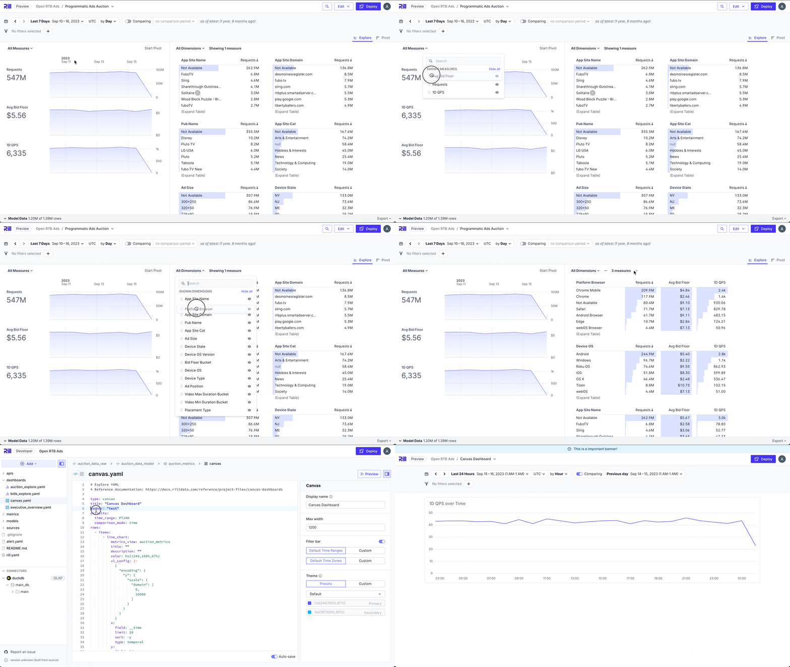
Re-order Timeseries and Leaderboards
Any user can now re-order their timeseries and leaderboards. Put the metric that is most important to you at the top!
In subsequent releases of Rill, we will also remember your choices so you don't have to re-order them on every visit.
Toggle off Custom Time Ranges
If you want to enforce a specific time range, you now have the ability to disable custom time range selection by specifying allow_custom_time_range: false in your Explore and Canvas YAML files.
Banner in Canvas
Setting and displaying a banner is now supported in Canvas dashboards.
Use DSN for OLAP Connectors
You can now specify a full DSN string for your OLAP connectors such as ClickHouse and Pinot, making it even easier to connect.
Snowflake Password Authentication Update
Snowflake is starting to phase out single-factor password authentication. If you are using password authentication for your Snowflake source, we recommend migrating to private key authentication to avoid service disruptions.
Bug Fixes and Misc
- Fixed various bugs, UX improvements, and new features around Canvas dashboards:
- Browser tab header fix
- Local filter comparison toggle
- Chart improvements (visual and local filters)
- Updated URL paths
- Removed components from Rill Cloud's Status page
- Image alignment
- Flat table
- Chart with special characters
- Deprecated
title, usedisplay_nameinstead - Charts with no time dimensions
- Banner support
- Fixed issue around report links not working due to user account removal, etc.
- [UX] Redeploy confirmation note closes after confirming
- Fixed bug where query cancellation cached an empty time series
- Fixed non-standard model names in SQL files (escaped properly)
- ClickHouse improvements:
- Connection concurrency
- MotherDuck / DuckDB model executor
- Always show OLAP engine option in Rill Developer
- Fixed bug around comparison fallbacks causing issues with certain time ranges
- [UX] Advanced SQL expressions now support multiple lines in the Visual Metrics Editor
- [UX] Improved leaderboard loading state
- Support for
.envfiles in nested project directories - Automatically apply changes to security mapping policy files
- Fixed bug around exporting XLSX files in Explore dashboards
- Fixed issue with renamed orgs not being reflected due to
display_name - Increased default maximum concurrent model executions to 5
- Improved performance of DuckDB-based projects due to optimized catalog queries
- Fixed issue in Rill Developer where model references were not tracked properly
- Fixed bug where
pre_execcaused incremental inserts to be skipped