Rill 0.17 – Increased information density
⚡ Rill Developer is a tool that makes it effortless to transform your datasets with SQL and create powerful, opinionated dashboards. These are our release notes for our 0.17 release, still in Tech Preview.
To try out Rill Developer, check out these instructions and let us know over on Discord if you encounter any problems or have ideas about how to improve Rill Developer!
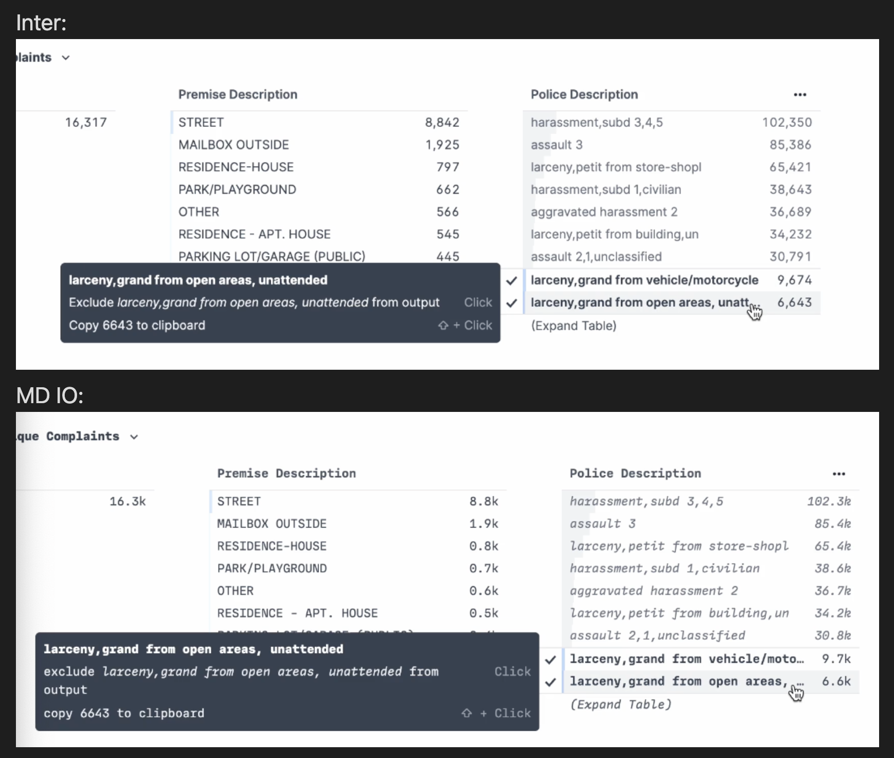
In this release we kick off a major change in the look of the application with a typography update. We have been using a monospace font, MD IO, since January because in addition to being quite handsome, it's monospace structure gives each letter the same width making it easy to scan and reason about numbers.
Unfortunately, as our application has grown we have started paying a tax for this choice because the characters are too wide. Our application is extremely information dense and we need to be thoughtful about the number of characters we can fit on the screen to maximize the utility of a limited number of pixels. Choosing a narrow font provides us the ability to present more information on the “x-axis”.
Monospace can also feel code-oriented because of it’s origin. Monospace fonts were created to support building computer software and are often used in IDEs and text editors to made code more readable. However, monospace fonts tend to feel less approachable to people without a technical background. Applying a font that feels board-deck-ready makes it feel good to share Rill’s insights with people that don’t spend most of their time in an IDE.
With this in mind, we decided to move to the free, open-source, grotesque font Inter:
- Goodbye MD IO, hello Inter — We like Inter at Rill because we want to build information-dense displays in ways that feel really good for everyone. Inter is a high-quality font that is well-optimized for smaller text sizes / UIs and will give us new abilities to present more information for more people to consume in a clear way.
Typography has a huge impact on the visual impression and spacing of elements in our application. We have tightened up some of these elements and adjusted font weights to accommodate these changes. In short - expect a bit of a vibe shift! While we are very excited to present more information in your display with Inter, we expect that things might not feel quite right while we get used to the new information density and gestalt. Please visit us on Discord to report any rough edges you encounter.