Rill 0.58 - Canvas dashboards
⚡ Rill Developer is a tool that makes it effortless to transform your datasets with SQL and create fast, exploratory dashboards. Rill Cloud can then help enable shared collaboration at scale.
To try out Rill Developer, check out these instructions and join us over on Discord to meet the team behind the product as well as other users. In addition, once you have a project set up in Rill Developer, you can then deploy the project and collaborate with others / invite your team members by logging into Rill Cloud!

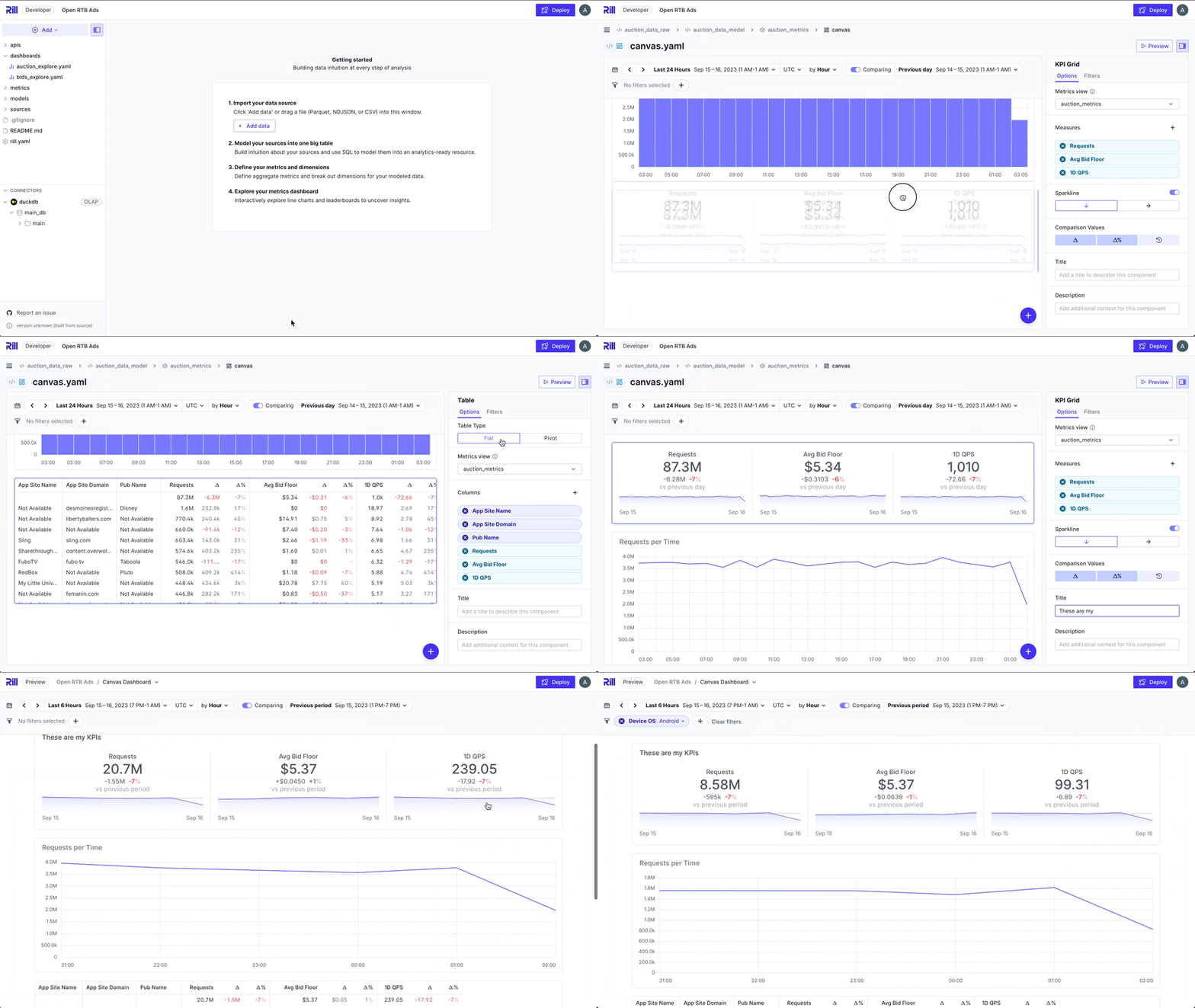
New Kid on the Block: Canvas dashboards! 🖌️
We’re proud to introduce the beta version of a brand-new dashboard type in Rill — Canvas dashboards!
While our auto-generated Explore dashboards let you effortlessly explore, slice and dice, and interact with your data, we've heard the need for more traditional dashboards. That’s where Canvas dashboards come in! They allow you to easily assemble dashboards that visualize data from multiple metric views.
Canvas dashboards share many of the same powerful features as Explore, including:
- A global filtering experience
- The ability to embed dashboards
- Reuse of existing dimension and measure definitions
For our beta release, you can create Canvas dashboards containing:
- KPIs featuring key measures
- Bar and stacked bar charts
- Line and area charts
- Tables
- Markdown text components
- Images
Canvas dashboards are a fantastic complement to your existing deployment, enabling you to build scorecards, high-level reports, or consolidated metric views — all in one place.
Happy building! 🚀
Bug Fixes and Misc
- Improved performance and stability in Canvas dashboards.
- Changes to user management, including adding
guestandeditorand how project users are handled. See documentation for more information. - Added
treat_nulls_asto metrics view parameters. Works similarly to COALESCE over non empty time buckets. - Better error handling around GCP credentials.
- Improved query performance in Pinot.
- Improved testing of Rill components resulting in improved stabillity.
- Improvements in Flat Table’s appearance.
- Fixed a bug in the visual metrics editor. when setting D3-format on measure.
- Fixed a bug involving tokens created by deleted users.