Rill 0.41 - Pivot tables, AI dashboard generation, Clickhouse connection, more defaults, picking up where you left off and more! 🚀
⚡ Rill Developer is a tool that makes it effortless to transform your datasets with SQL and create fast, exploratory dashboards.
To try out Rill Developer, check out these instructions and join us over on Discord to meet the team behind the product as well as other users!

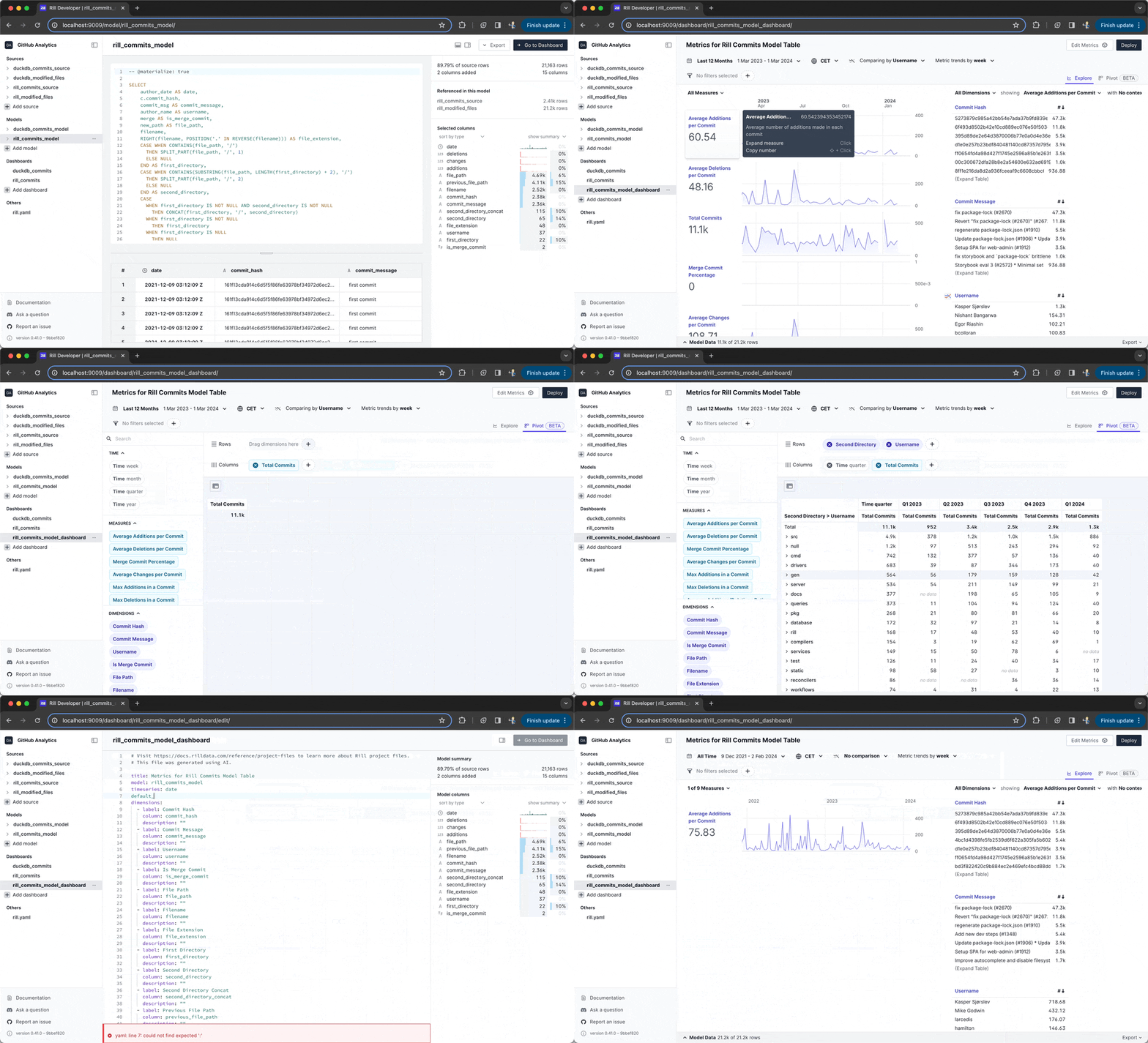
Pivot Table
Our first release of the pivot table is now live and we are super excited! You can now freely explore your data in a tabular format by mixing and matching dimensions, measures and time to your own liking. This is our first release of the pivot table so any feedback is welcome and we have many more exciting enhancements planned for the future!
AI Dashboard generation
We have incorporated AI to quickly help you generate a dashboard from a model. With a single click Rill will now auto-generate a dashboard for you with a set of suggested measures and dimensions to help you get to a dashboard even faster!
Live connection for Clickhouse
We have added a new driver for Clickhouse that allows you to have a live connection to a Clickhouse instance and directly create dashboards from your datasets. Refer docs here for more details.
Default comparisons
Previously in Rill, time comparison were turned on by default. We have now switched to comparisons being off by default and also introduced new syntax to the dashboard.yaml that allows you to specify either your own time or dimensional comparison modes.
Dimension expressions
In addition to being able to define a specific column in your dataset as a dimension you can now supply an expression instead. That allows you to either visually transform the data without touching the underlying data model or for example to un-nest a nested column directly from your dimensions.
Rill remembers
If Pepperidge farm remembers so should Rill. We will now remember which dimensions and measures you were looking at and will automatically apply those for you when you come back to a dashboard.
Default Dimensions and Measures
Dashboards can get crowded, the number of dimensions and measures grows over time. You can now specify which dimensions and measures that should be visible by default on the dashboard through new syntax in the dashboard.yaml. This allows you to control which measures and dimensions that should be visible for your users, making the initial cognitive load smaller while still allowing you to add more to the dashboard as you need them.
Support for environment-specific YAML configurations
We love our local developer tool but when working with very large datasets locally even the best of laptop can slow to a crawl.
In a first effort to support the local developer experience we have added the ability to define environment-specific variables so that you can have down-sampled data size on local in development mode and still retain your full dataset in production. By templating in different sources depending on environment working with a local version will be as easy as rill start without having to make local changes every time you clone a project.
Bug Fixes and Misc
- Ensured better consistency when clearing filters.
- Improved error message when trying to run
rill deploywithout being logged in. - Introduced safeguards and an error message when trying to start Rill in a directory with over 1,000 files.
- Added hardening to dashboards with no timestamp columns defined.
- Fixed bug where exclude filter can break the comparison with previous period.
- Ensured exports are always properly applying measure filters.
- Introduced backend optimizations to improve query response times for toplists.
- Added further consistency in themes to ensure the spinner is always taking the secondary color input.
- Added hardening to improve how query cancellation works in the application.
- Improved how dashboard URLs for reports are constructed to ensure better consistency in the URL state.
- Refactored error handling in dashboards so that 400 errors fail at the component level instead of at the dashboard level, preventing a full-screen error page.
- Fixed a bug where using mock users to "view as" and test access policies locally were not always working properly.
- Introduced some slight cosmetic cleanup and consistency to the Rill Cloud home and login pages.
- Added some hardening and improvements to how measure filter parameters are handled, especially for validation purposes.
- Fixed a regression related to autocasting for
BIGNUMERICtypes from BigQuery. - Improved hardening and resiliency of toplist and leaderboard queries to minimize dashboard crashes.
- Improved install script to better support POSIX compliance and work OOTB with Ubuntu.
- Upgraded our Snowflake driver.
- Automatically materialize models backing dashboards in Rill Cloud, which should result in improved performance.