Rill 0.57 - Flat tables
⚡ Rill Developer is a tool that makes it effortless to transform your datasets with SQL and create fast, exploratory dashboards. Rill Cloud can then help to enable shared collaboration at scale.
To try out Rill Developer, check out these instructions and join us over on Discord to meet the team behind the product as well as other users. In addition, once you have a project set up in Rill Developer, you can then deploy the project and collaborate with others / invite your team members by logging into Rill Cloud!

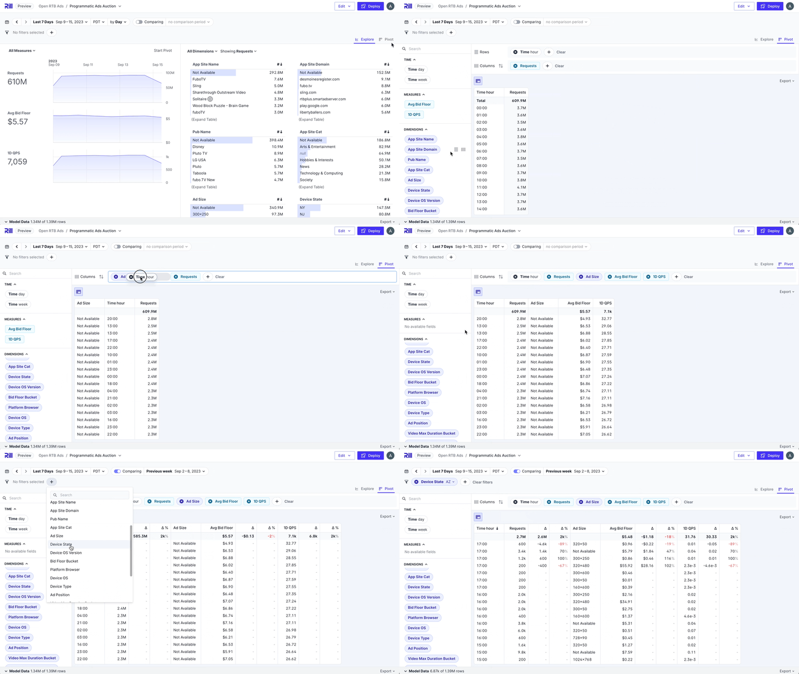
Introducing the flat table
While pivot tables are great, sometimes you just need a simple, straightforward table of data. Starting today, you can toggle between nested and flat modes for your table, making it easy to switch between a pivoted view and a flat view. In flat mode, you can freely arrange measures and dimensions interchangeably, giving you more flexibility in organizing your data.
Bug Fixes and Misc
- Allow all users to view the "Last refreshed" date in an Explore dashboard.
- Additional functionality for embedded dashboards,
getStateandsetState. - Additional functionality to the
rill querycommand, support for CSV and Table output with--format. - Improved user experience on Rill Developer due to click/type lag that would occur due to the auto-save feature.
- Save scroll and location in Rill Developer when navigating files.
- Added a confirmation screen for updating a deployment via the UI.
- Split
init_queriesin advanced models todb_initandconn_initqueries. - Global DuckDB properties set with global scope.
- Added check of home directory on
rill start. - Fixed search text remaining after exiting the UI.
- Fixed bug causing inconsistent TDD tooltip and formatted value.
- Fixed bug in metrics view that sets both
format_presetandformat_d3. - Fixed bug with custom time range comparison returning undefined.
- Fixed bug in dimension filter searching for 'null' value.
- Fixed bug in MotherDuck connector due to lock configuration setting.
- Fixed bug on exports ignoring filters.
- Fixed forever loading explore dashboard, now displays error.
- Fixed bug where false displayed as 'null' in TDD chart.
- Fixed bug when sorting on a delta column in pivot table.
- Fixed bugs around logo/favicon upload issues, and it's effect on organization object in Rill Cloud.
- Fixed bug around first-time project deployment displaying a white screen instead of loading the page.
- Fixed bug around expired sessions not being redirected to the login screen.
- Fixed bug in Rill Developer where the "New Source" dialogue prompt opens on old datasets.
- Fixed bug around copying value via shift-click, unselects or selects value.