Rill 0.52 - Visual Explore Editing, human readable URLs, env variables in the cloud and breadcrumbs!
⚡ Rill Developer is a tool that makes it effortless to transform your datasets with SQL and create fast, exploratory dashboards. Rill Cloud can then help to enable shared collaboration at scale.
To try out Rill Developer, check out these instructions and join us over on Discord to meet the team behind the product as well as other users. In addition, once you have a project set up in Rill Developer, you can then deploy the project and collaborate with others / invite your team members by logging into Rill Cloud!

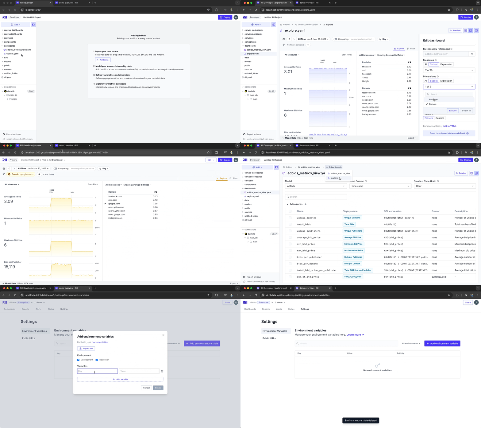
Visual Explore Editing
With our 0.51 release we introduced the ability to visually edit metrics and dimensions in the metrics view. Now we are extending the same capabilities also for Explore dashboards. So if you prefer a UX experience over editing yaml files directly then this is for you!
Human Readable URLs
As you navigate around inside of a Rill dashboard what you see on the screen is always present in the URL so that you can easily share that URL with other users and they will see exactly what you are seeing on the screen. Previously we encoded this URL so that it was very hard to read, change or make updates to but with our 0.52 release the URL will now be fully human readable. This allows you to more easily embed a Rill dashboard into intranets and dynamically change what the user sees on the screen and when you get sent a link from someone it's easier to understand what the actual URL will show on the screen.
Environment Variables - Manage in Rill Cloud
In Rill Cloud you can now visually manage your environment variables for a project. Add, update or delete them directly from Rill Cloud without having to fire up the Rill CLI. Change a password env variable and all your developers have to do is a rill env pull and they are up-to-date!
Project Breadcrumbs in Rill Developer
As you are navigating around in Rill Developer you will now find breadcrumbs that shows you the associated resources so that you can quickly navigate between them as you are making changes. An early quality of life holiday present!
Bug Fixes and Misc
- Added support for STS AssumeRole in Athena connector.
- Support locate formatting using
d3_localein metrics view. - Added UI for Environment Variables in Rill Cloud.
- Removed "Back to Home" from Embed Dashboards.
- Improved Big number KPI formatting rules.
- Default to UTC when no timezones are selected.
- Environmental Variables are now available in security policies.
- Port not required when connecting to Cloud OLAP URL.
- Improved UI: Improved project user list UI.
- Improved UI: Improved buttons to return to Explore main page.
- Improved UX: Disable slack notification by default.
- Improved UX: Refresh button should initiate incremental refresh where possible.
- Improved UX: Support infinite query when listing org users and invites.
- Improved UX: Offer to copy to clipboard CTA when creating public URL
- Improved UX: Users able to drag and select multiple values to copy in pivot.
- Improved UX: Add clear button on pivot header for rows and columns.
- Improved UX: Added error handling for row access policies.
- fixed Leaderboard column sorting behavior.
- fixed
Select allbutton in the dimension leaderboard. - fixed Scroll position in pivot table when loading new rows.
- fixed environmental overrides in rill.yaml.
- fixed custom compare time ranges in reports or alerts.
- fixed leaderboard header no label issue, defaults to name.
- fixed case issues with bookmarks.
- fixed autogenerated metric view indentation and default parameters.
- fixed issue when switching dashboards based on the same metrics view in Rill Cloud.
- fixed formatting in TDD when formatting is not defined, use humanize.
- fixed issue in embed dashboard when pivot disabled,
Start pivotstill visible. - fixed issue where could not search by name in Org search.
- fixed issue where limit was not being applied to exports.
- fixed issue when disabling compare dimension in TDD not being respected.
- fixed issue where ClickHouse would auto unnest in metrics view.