Canvas Dashboards
Canvas dashboards are composed of one more more charts. Now that we've learned how to create charts via Rill-provided templates and via custom component with vega-lite, we can add and arrange these on Canvas dashboard.
Create a Canvas dashboard
Via the UI, select Canvas Dashboard
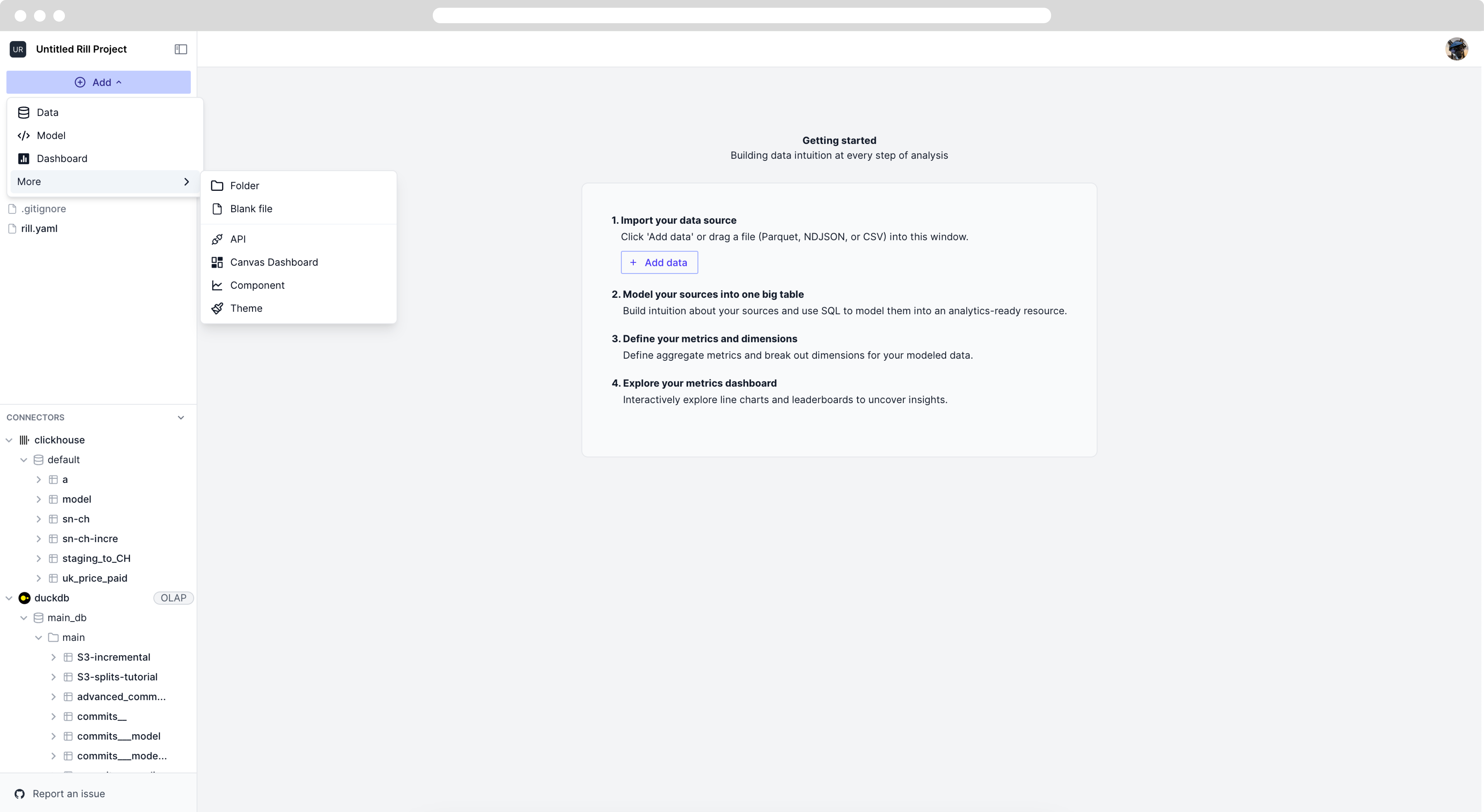
You will notice three options in the UI for creating dashboards.
- code
- split
- viz
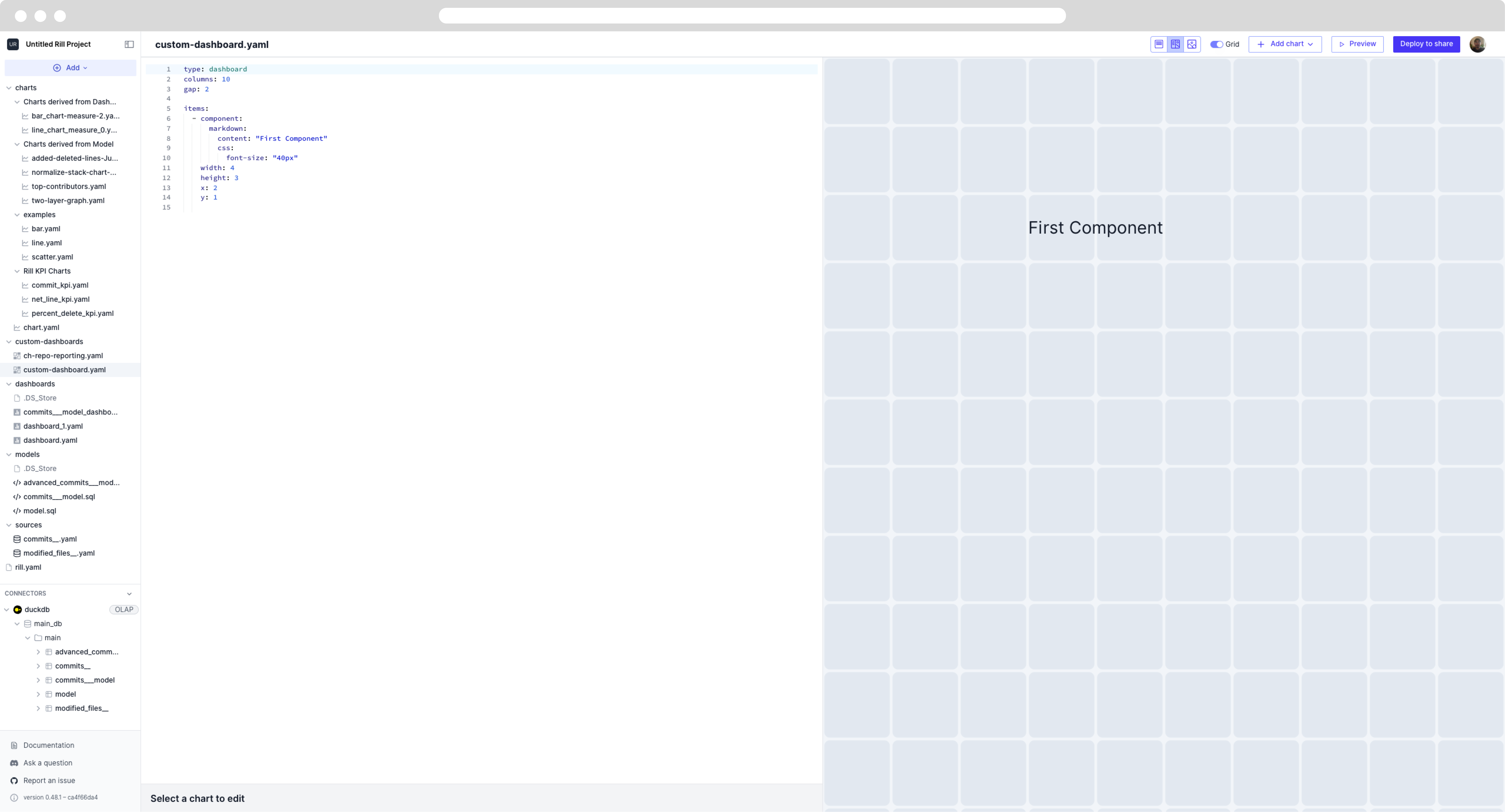
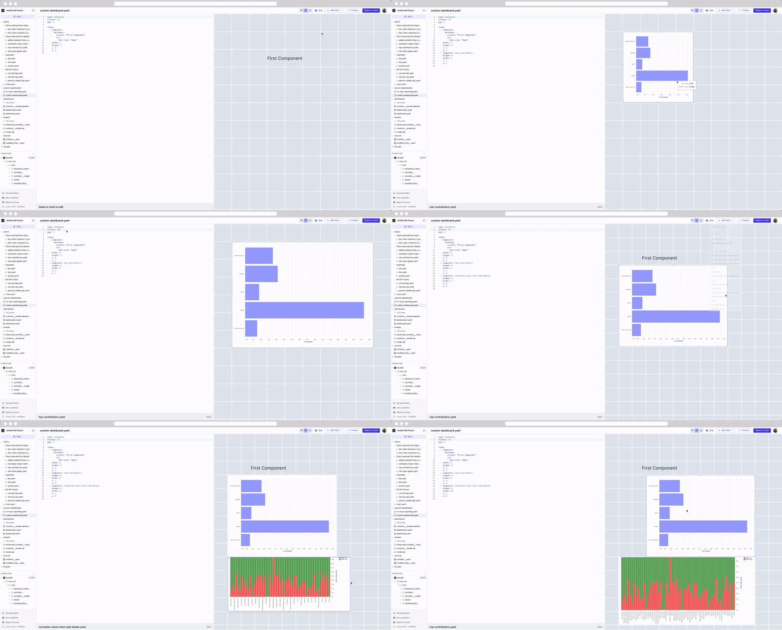
In both the split and viz mode, we can drag and drop chart components into the Canvas dashboard.
You'll notice that in the YAML for the dashboard, you can adjust the columns, which will adjust the number of squares on the screen. Let's go ahead and drag our two custom components that we built!
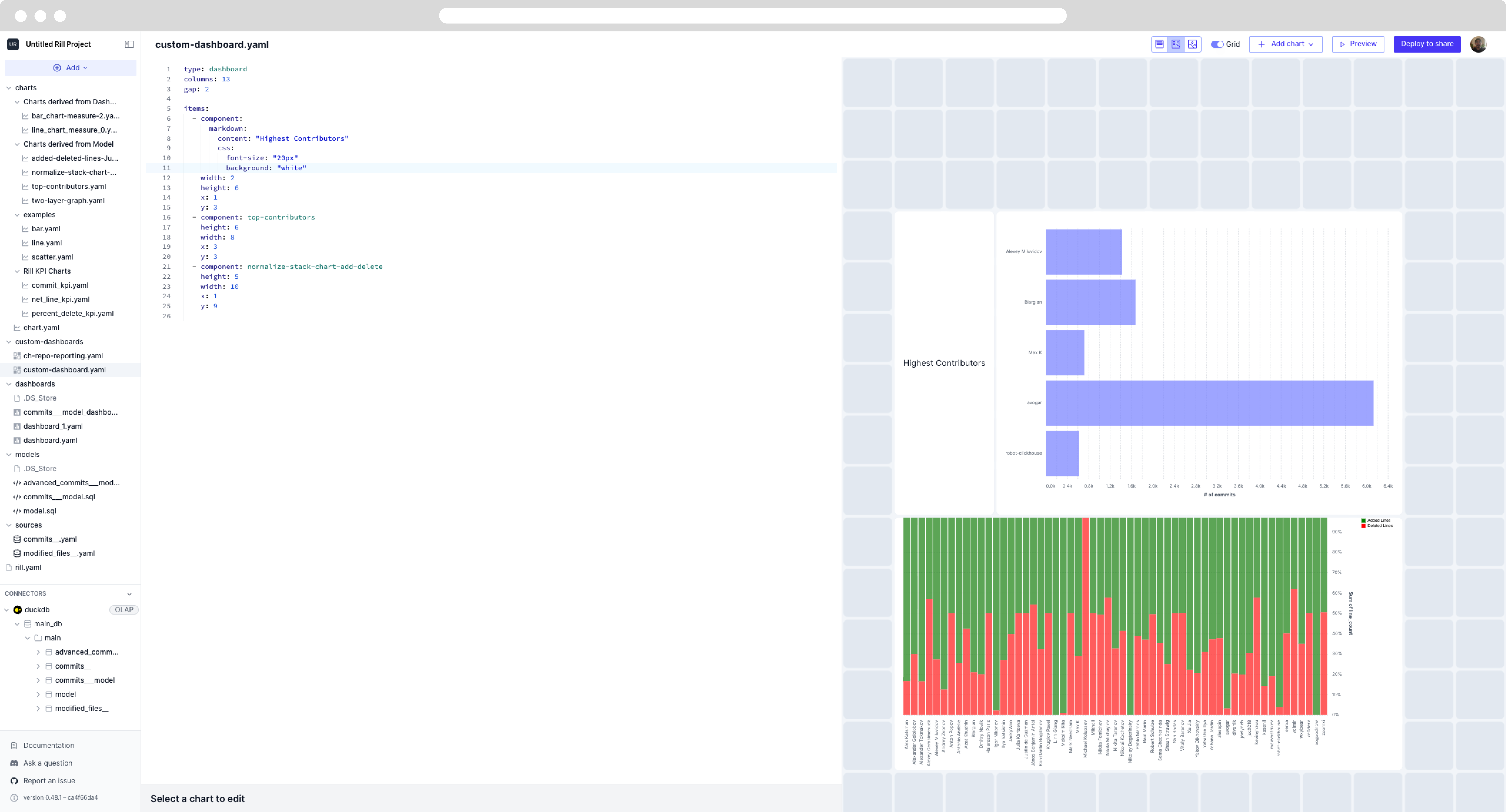
Using the markdown component under items, we can label the highest contributors chart and set the background white.
Finally, using some of the Rill template KPI charts, we can finish off the Canvas dashboard by showing some easy to understand charts, along with a title.
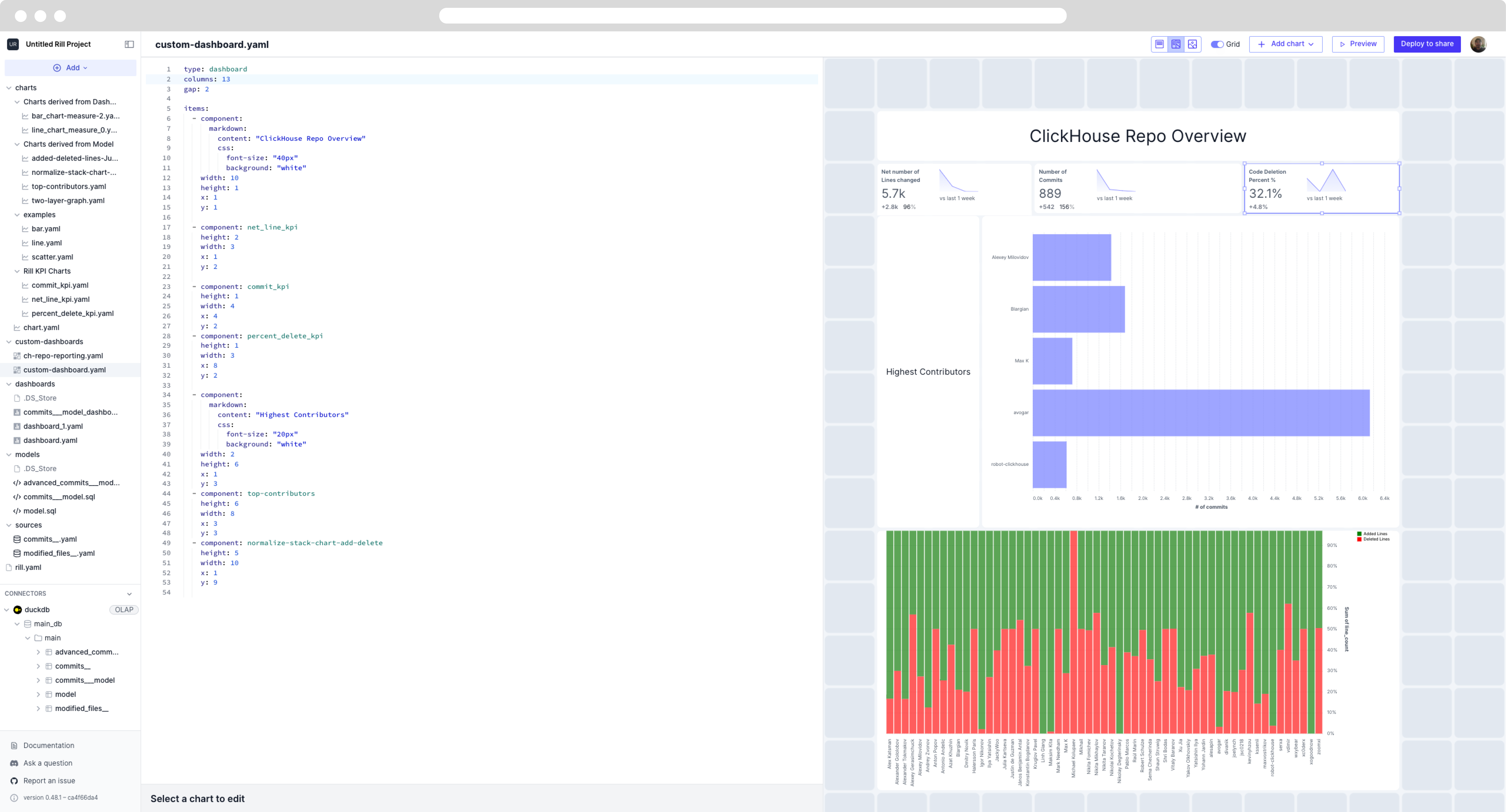
If you had any issues building the Canvas dashboard, please refer to the YAML below.
type: canvas
columns: 13
gap: 2

items:
  - component:
      markdown:
        content: "ClickHouse Repo Overview"
        css:
          font-size: "40px"
          background: "white"
    width: 10
    height: 1
    x: 1
    y: 1

  - component: net_line_kpi
    height: 2
    width: 3
    x: 1
    y: 2

  - component: commit_kpi
    height: 1
    width: 4
    x: 4
    y: 2
  - component: percent_delete_kpi
    height: 1
    width: 3
    x: 8
    y: 2

  - component:
      markdown:
        content: "Highest Contributors"
        css:
          font-size: "20px"
          background: "white"
    width: 2
    height: 6
    x: 1
    y: 3
  - component: top-contributors
    height: 6
    width: 8
    x: 3
    y: 3
  - component: normalize-stack-chart-add-delete
    height: 5
    width: 10
    x: 1
    y: 9
These are just two simple custom graphs that can be built using Vega Lite. Please refer to Vega Lite documentation and examples for further inspiration on how you can build your very own Canvas dashboard.
The current canvas dashboard is nice but it lacks the ability to filter based on different dimenions. Let's add that.
Was this content helpful?