Chart Widgets
Chart widgets in Rill Canvas allow you to visualize your data in various formats. You can create charts dynamically in the Canvas Dashboard or through individual component files. For more information, refer to our Components reference doc.
Bar Chart
Bar charts are ideal for comparing values across different categories.
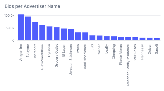
- bar_chart:metrics_view: bids_metricscolor: primaryx:field: advertiser_namelimit: 20showNull: truetype: nominalsort: -yy:field: total_bidstype: quantitativezeroBasedOrigin: true
Horizontal Bar Chart
x and y always name the field drawn on that axis. To draw the bars from left to right, which works well for long category labels or many categories, put the measure on x and the dimension on y. Sort values refer to axes, so sort: -x on y orders the categories by the measure. The same layout works for stacked_bar and stacked_bar_normalized; line and area charts always keep the dimension on x.
- bar_chart:
    metrics_view: bids_metrics
    color: primary
    x:
      field: total_bids
      type: quantitative
      zeroBasedOrigin: true
    y:
      field: advertiser_name
      limit: 20
      type: nominal
      sort: -x
Axis label orientation
Category labels on the x-axis are laid out automatically: they stay upright when they fit, tilt to 45° when they do not, and only turn vertical when the chart is too narrow for angled text. Long labels are shortened with an ellipsis; hovering a bar shows the full value in its tooltip. To force an orientation, choose Label orientation in the field settings or set labelAngle on the x field to 0 (horizontal), -45 (angled) or -90 (vertical).
Line Chart
Line charts are perfect for showing trends over time.
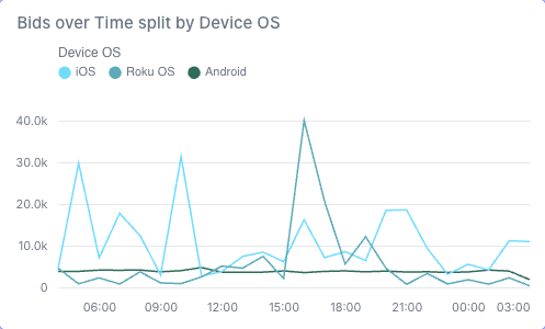
- line_chart:metrics_view: bids_metricscolor:field: device_oslimit: 3type: nominalx:field: __timelimit: 20sort: -ytype: temporaly:field: total_bidstype: quantitativezeroBasedOrigin: true
Stacked Area Chart
Area charts show the magnitude of change over time with filled areas.
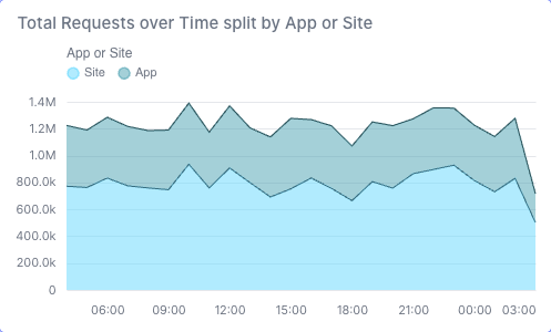
- area_chart:color:field: app_or_sitetype: nominalmetrics_view: auction_metricsx:field: __timelimit: 20showNull: truetype: temporaly:field: requeststype: quantitativezeroBasedOrigin: true
Stacked Bar Chart
Stacked bar charts show multiple data series stacked on top of each other.
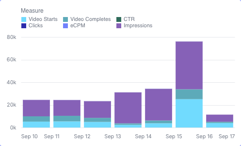
- stacked_bar:color:field: rill_measureslegendOrientation: toptype: valuemetrics_view: bids_metricsx:field: __timelimit: 20type: temporaly:field: clicksfields:- video_starts- video_completes- ctr- clicks- ecpm- impressionstype: quantitativezeroBasedOrigin: true
Stacked Bar Normalized
Normalized stacked bars show proportions instead of absolute values.
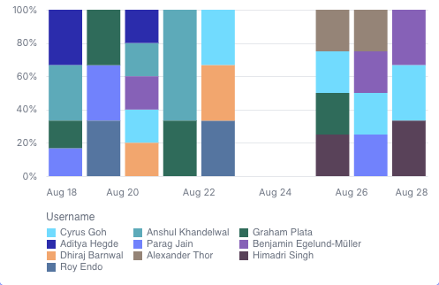
- stacked_bar_normalized:color:field: usernamelimit: 3type: nominalmetrics_view: rill_commits_metricsx:field: datelimit: 20type: temporaly:field: number_of_commitstype: quantitativezeroBasedOrigin: true
Donut Chart
Donut charts display data as segments of a circle with a hollow center.
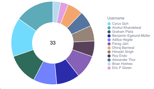
- donut_chart:color:field: usernamelimit: 20type: nominalinnerRadius: 50measure:field: number_of_commitstype: quantitativemetrics_view: rill_commits_metrics
Funnel Chart
Funnel charts show the flow through a process with decreasing/increasing values at each stage.
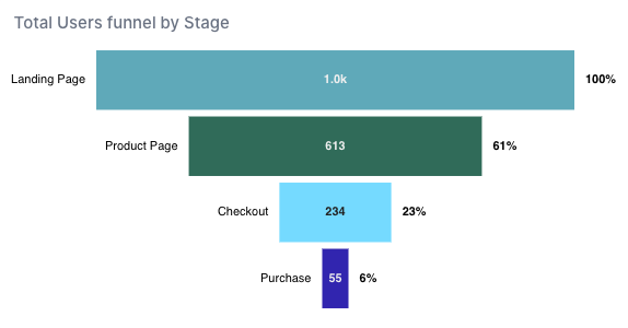
- funnel_chart:color: stagemeasure:field: total_users_measuretype: quantitativemetrics_view: Funnel_Dataset_metricsmode: widthstage:field: stagelimit: 15type: nominal
Heat Map
Heat maps visualize data density using color intensity across two dimensions.
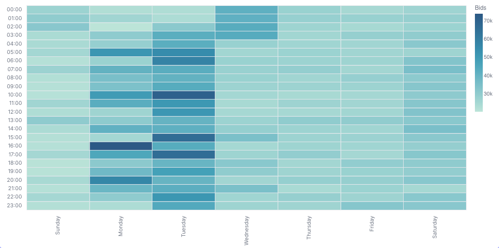
- heatmap:color:field: total_bidstype: quantitativemetrics_view: bids_metricsx:field: daylimit: 10type: nominalsort:- Sunday- Monday- Tuesday- Wednesday- Thursday- Friday- Saturdayy:field: hourlimit: 24type: nominalsort: y
Combo Chart
Combo charts combine different chart types (like bars and lines) in a single visualization.
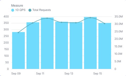
- combo_chart:color:field: measureslegendOrientation: toptype: valuemetrics_view: auction_metricsx:field: __timelimit: 20type: temporaly1:field: 1d_qpsmark: bartype: quantitativezeroBasedOrigin: truey2:field: requestsmark: linetype: quantitativezeroBasedOrigin: true
Scatter Plot
Scatter plots visualize the relationship between two measures, with each point representing a data value. Points can be colored by a dimension and optionally sized by a measure. Scatter plots support interactive zooming and panning.
Interactive Controls:
- Shift + Drag: Pan the plot
- Scroll Wheel: Zoom in/out
- Double-click: Reset zoom and pan to default view
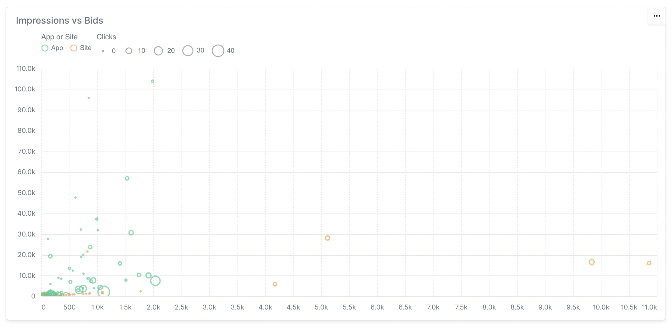
- scatter_plot:metrics_view: bids_metricsx:field: total_bidstype: quantitativezeroBasedOrigin: falsey:field: total_clickstype: quantitativezeroBasedOrigin: falsedimension:field: advertiser_namelimit: 10type: nominalsize:field: total_impressionstype: quantitativecolor:field: device_oslimit: 5type: nominallegendOrientation: top